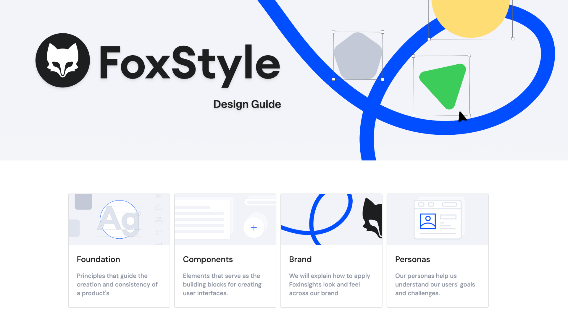
.svg)
FoxStyle Figma
.png)
Design System Development and Maintenance
Building of new components
Refining and improving of existing components
Ownership of the design-to-development handoff for components I worked on
Migrating the icon set to Material Symbols (M3)
Introducing and integrating a new typography system across the product
Documentation, structural cleanup, and general system hygiene
Figma
Adobe Illustrator
Zeplin
Storybook
The design system needed to scale alongside the product. New features were being shipped quickly, but inconsistencies between components and outdated patterns were starting to slow things down. The goal: make the system reliable enough that designers and developers could move faster by using it.
Challenges
Working in a living system:
The product never stopped shipping while I was making changes. That meant every update had to be planned carefully.
Balancing flexibility and consistency:
Components need to be flexible enough to cover real product needs, but strict enough to keep the system coherent. Finding that line was a constant negotiation.
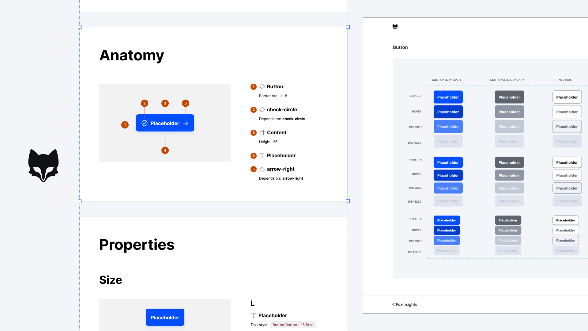
Developer Handoff in Zeplin
For the components I worked on, I owned the handoff to development in Zeplin. This meant documenting each component so it could be built without follow-up questions.
That included
- Clearly defined specs for spacing, typography, and colors that are connected to tokens
- All relevant states (default, hover, active, disabled, error)
- Additional notes on how components behaved across different contexts
The result was a reliable single source of truth that gave the dev team clear guidance and noticeably reduced back-and-forth.
.gif)
Component Cleanup
The design system was started before Figma supported boolean properties, so every component variation lived as a separate variant making component sets bloated and hard to use.
I refactored them with booleans and instance swaps. The Input component, for example, went from a long list of variants to a single flexible component. I then rolled the cleaned-up versions into our prototypes, making them faster to build and easier to maintain.
.png)
Icons to Material Symbols
The icon set had grown inconsistently over time, mixing different styles and stroke weights. I migrated about 100 Icons to Material Symbols (Material Design 3), giving the product a consistent visual language with unified stroke weights and the flexibility to adjust weight, fill, and optical size when needed.
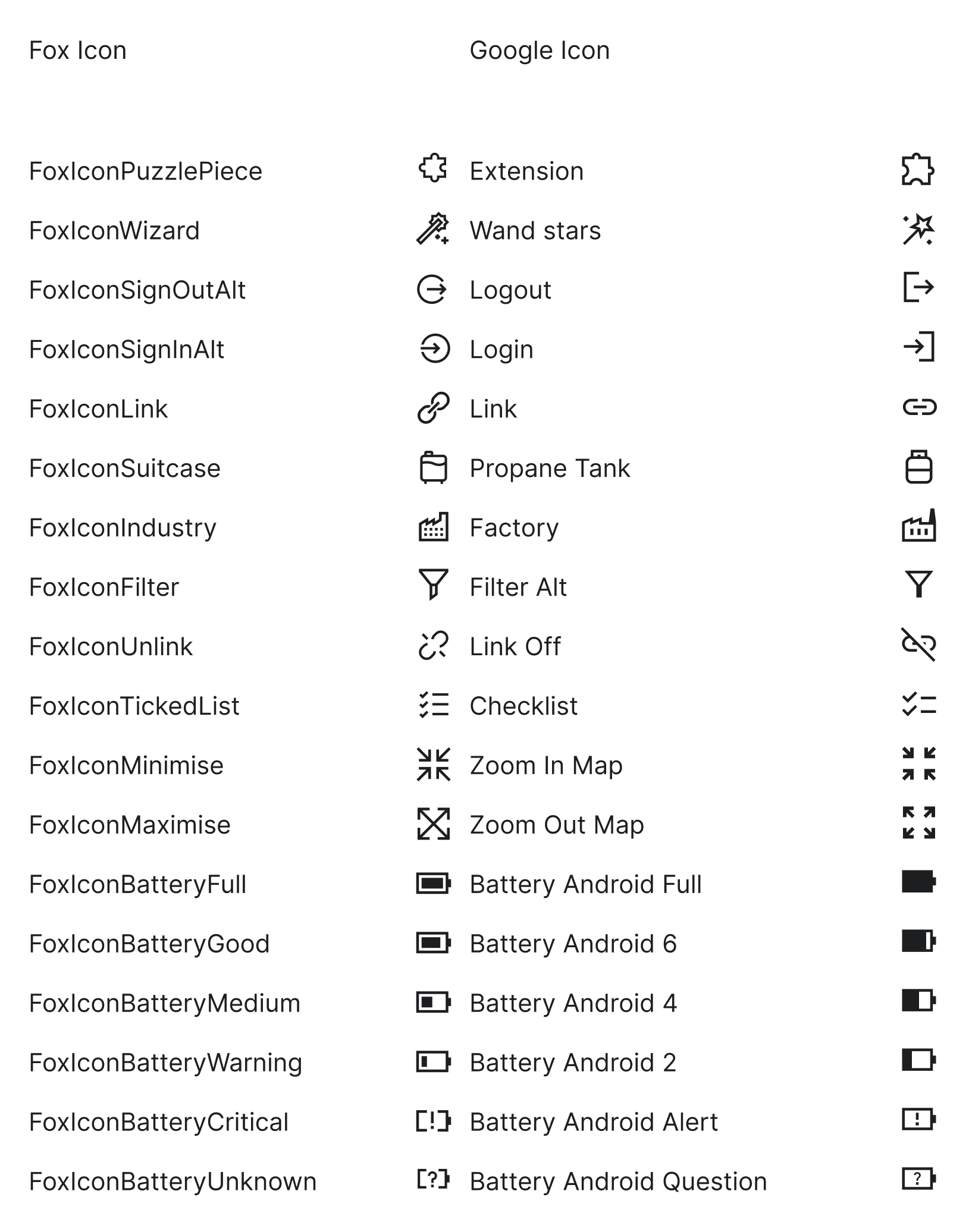
Icon layers
I also went through how the icons themselves were structured. Quite a few had been created using text layers (usually as a shortcut when working with icon fonts) but text layers don't belong in an icon system: they render inconsistently, behave unpredictably in handoff, and lack the precision of proper vectors. I rebuilt them as vector shapes across the board.
Another step was layer naming. Figma matches elements between variants by their layer names, so if two icons have differently named layers, properties like color won't carry over when you swap one for the other. I aligned the layer names across the entire icon set ti "Icon", so that swapping icons now works smoothly without breaking any applied styling.
.gif)
Outcome
- Leaner, more usable components: Refactoring variant-heavy components into flexible ones with boolean properties (like the Input) made them faster to use, easier to maintain, and quicker to drop into prototypes.
- Reliable handoff process: Components shipped to dev with full specs, states, and tokens documented in Zeplin, reducing back-and-forth between design and engineering.
- A more coherent visual language: Migrating icons to Material Symbols and rolling out a new typography system gave the product a more modern, consistent look across all features.
More work.