.svg)
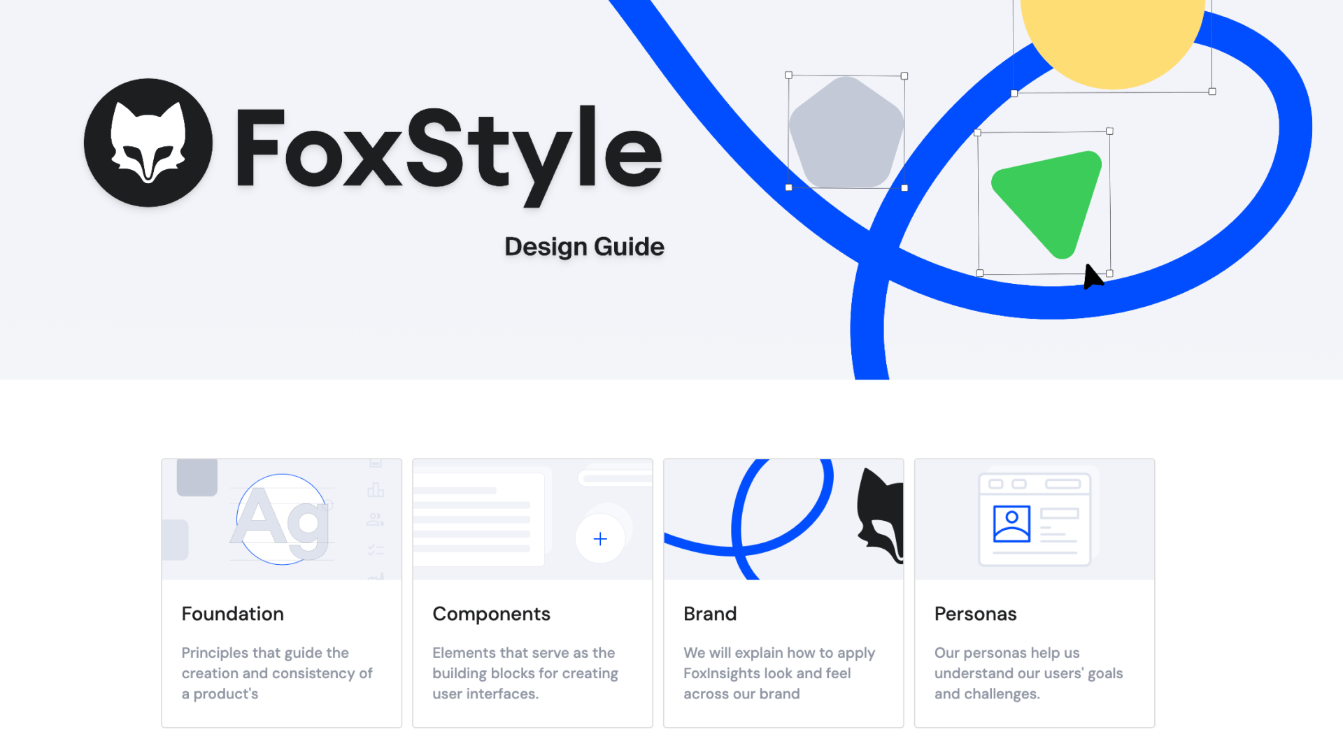
FoxStyle Zeroheight
.png)
Design Documentation and Dev-Collaboration
Design System Documentation
Brand Guidelines
Asset Library for Marketing
Ongoing maintenance
Zeroheight
Figma
Zeplin
Adobe Illustrator
Adobe After Effects
A component library only delivers value if people understand how and when to use it and a brand only stays consistent if the rules are accessible to everyone who touches it.
My task was to build out Zeroheight into a central hub where the design system, brand guidelines, and shared assets lived together, structured well enough that designers, developers, and marketing could find what they needed without asking.
.png)
Deliverables
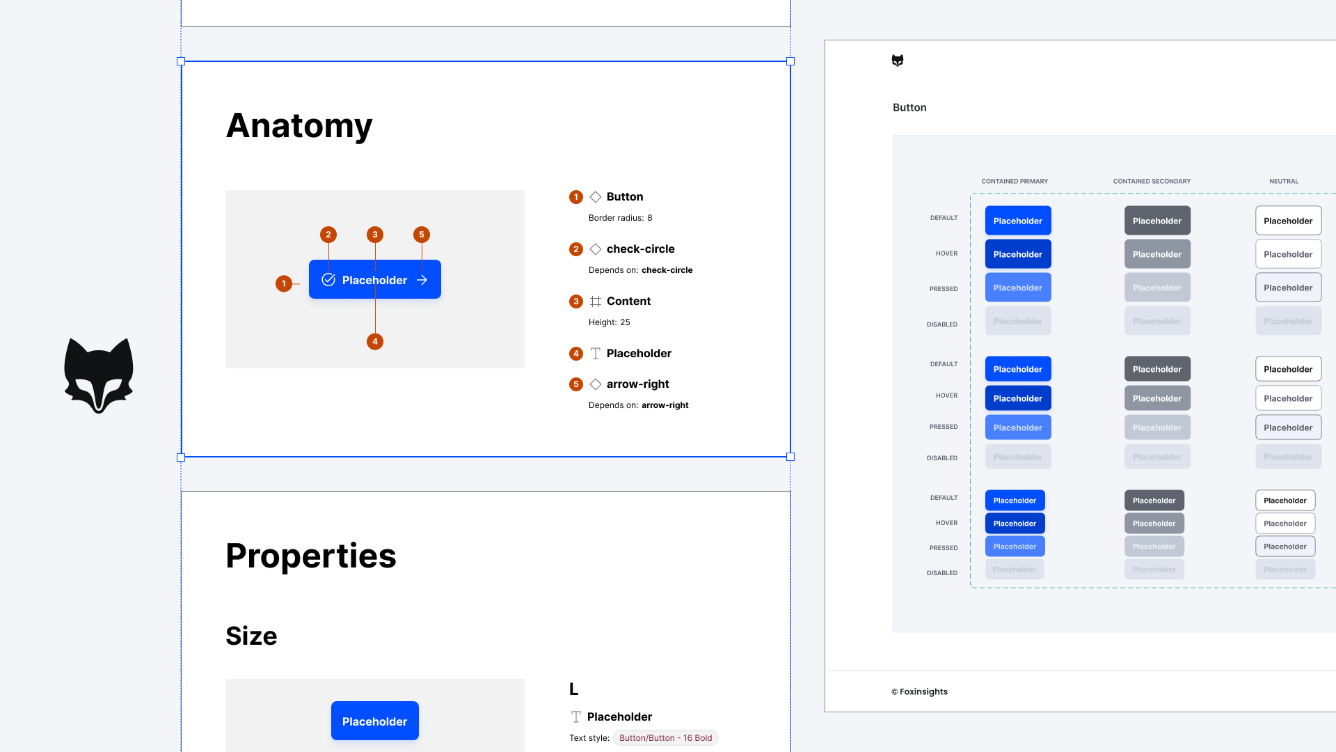
- Documented component pages with usage guidelines, examples, and developer notes
- A structured brand guidelines section covering visual identity, typography, color, and voice
- A central asset library accessible to marketing and other non-design teams
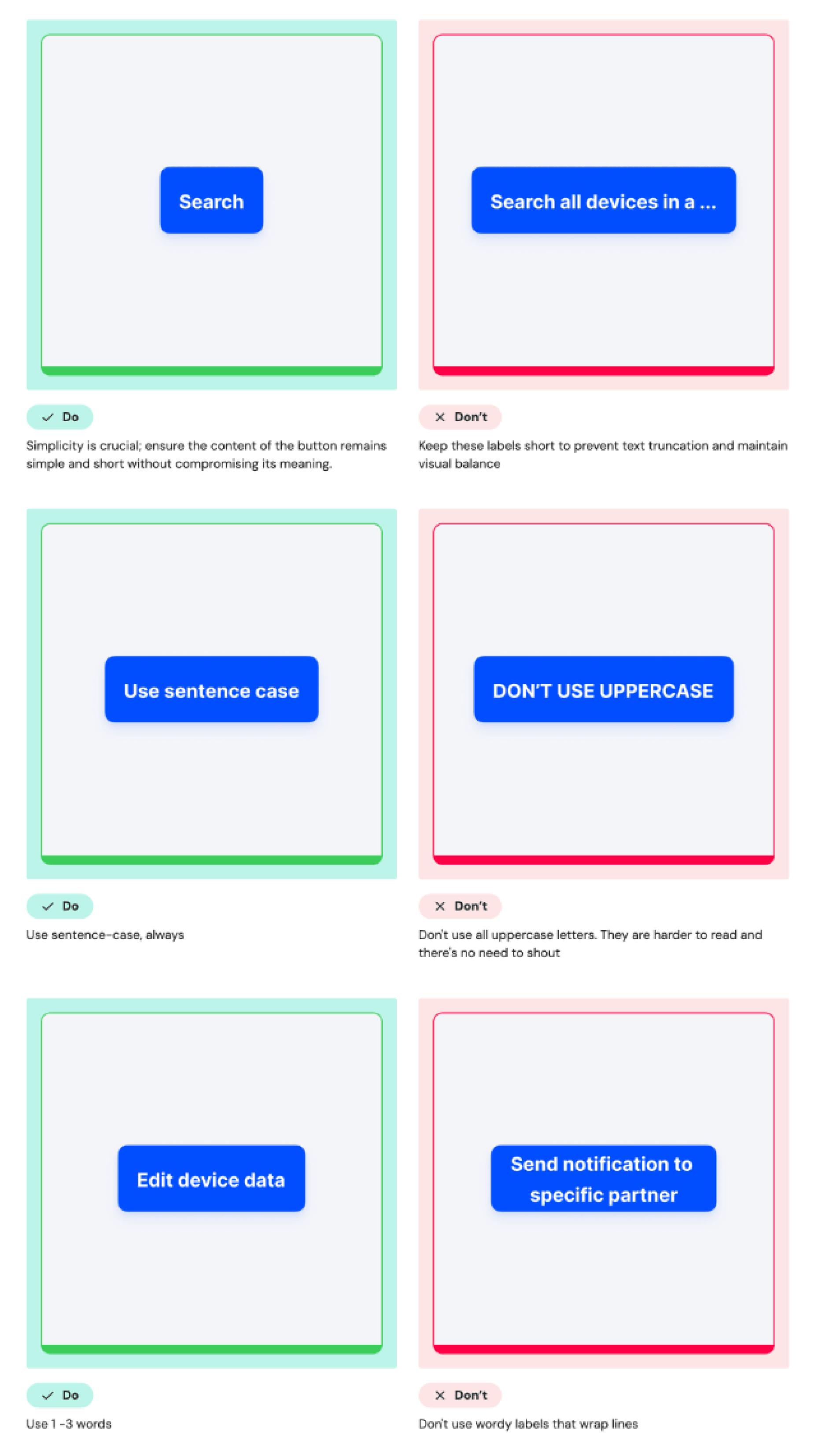
Do's and Don'ts
Do's and don'ts turn rules into clear examples. Instead of explaining a guideline in theory, they show the right and wrong use side by side, which makes decisions faster and reduces room for misinterpretation. For each component there is now a clear do's and don'ts section, that prevents mistakes.
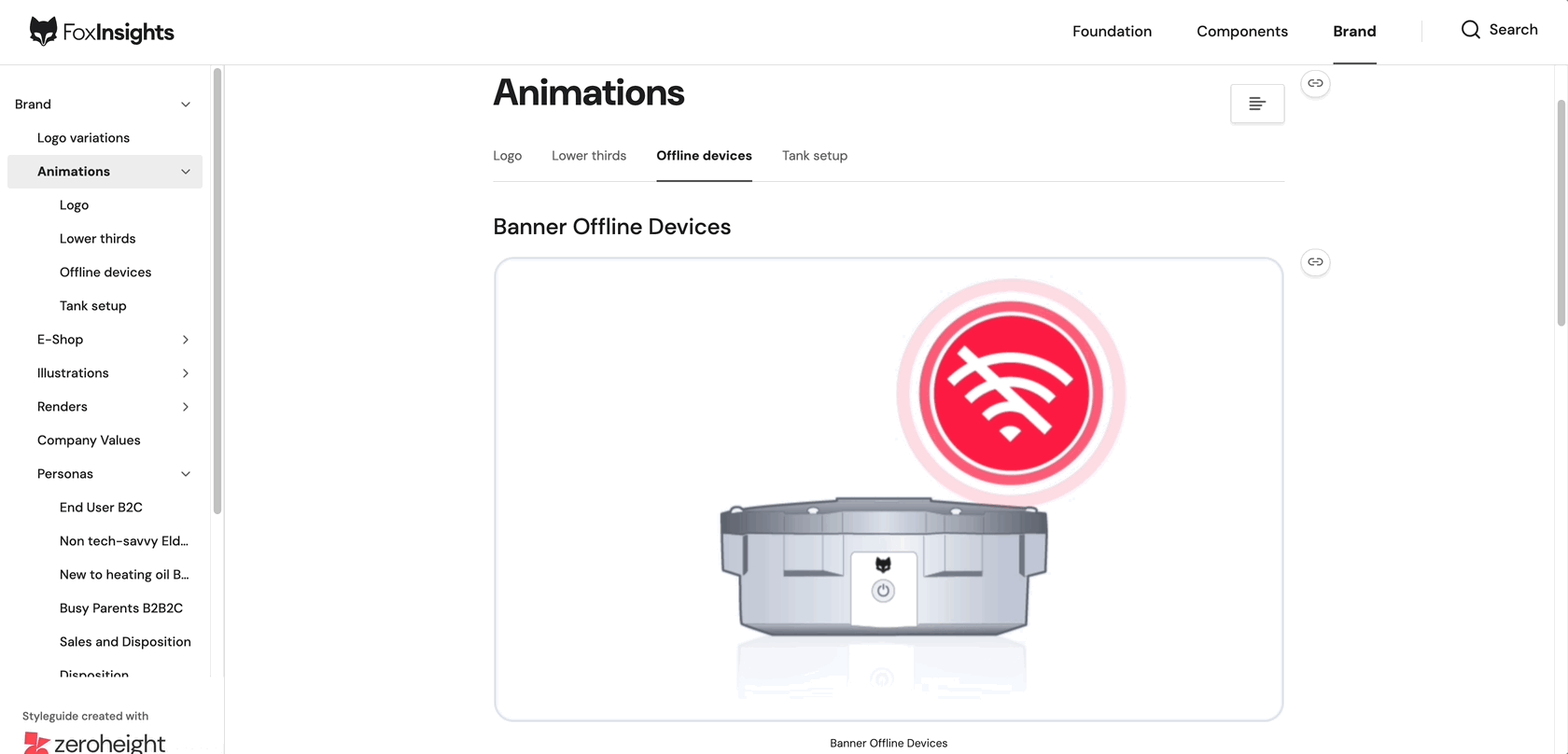
Animation and Image library
To make the motion work accessible across teams, I also built a dedicated image and animation gallery in zeroheight featuring the animations I created.
The library allows users to preview each animation in context, export them in multiple formats for direct use, and download the original After Effects project files for further customization.
This setup ensures designers and developers can either grab a ready-to-use asset or dive into the source files to adapt the animations to their own needs.
Challenges
Multiple audiences, one platform:
Designers and developers need different information than marketing or sales. Structuring the documentation so each group could quickly find what was relevant took ongoing iteration.
Keeping documentation in sync with reality:
The product was constantly evolving. Outdated documentation is worse than none as it actively misleads. Building habits around updating Zeroheight as part of the design process, not as an afterthought, was an ongoing effort.
Writing for clarity, not completeness:
It's tempting to document everything. But documentation that no one reads is a failure mode of its own. I learned to prioritize the questions people actually ask, and answer those well.
Learnings
A design system isn't just components, it's the documentation, the shared language, and the access that lets a whole company stay aligned. Zeroheight taught me that documentation is a design product in its own: it has users, it has UX, and it succeeds or fails based on whether people can actually use it.
More work.